
In accordance to the techniques of professional distributors I had to create my own marketing plan which consisted of three main products: The Official Monk Trailer and Monk movie poster which are regarded as advertising and a magazine cover which is regarded as publicity. The use of these three media components are responsible for generating hype and enticing the target audience specifically to want to see the Monk film.
Advertising
The importance of a trailer within the marketing plan; the audiovisual content is useful for displaying the most the most important portions of content as a way of enticing the target audience. However, there must be careful balance as not to spoil the entirety of the production. In professional terms, the trailer is the most cost-effective means of advertising and is derived from the pre-existing film footage. The prevalence of film trailers is massive in terms of digital medic convergence and can be accessed via: television, cinema screenings, the internet and even mobile phones. The benefits of a trailer is it's versatility and strength as a diverse media product - allowing its consumption anywhere in the world. In addition to the trailer is the partnering media product; the movie poster. A poster is the main image that is meant to capture the ethos of the film as well as detailing production values. The poster is made in harmony with the trailer in order to whet the appetite of the audience and again, the versatility of the poster is something that allows for a wide level exposure - there are over 250,000 sites for posters along the roadside and highways, with many more being shown in buildings, events, cinemas and other public facilities. For these reasons the convergence and interactability of the two products is imperative for success in the marketing campaign.


As the title of the movie suggests; the plot of the film is based around the character/antagonist: the monk. In order to give insight to the film plot I felt it was essential to create a prevalence of the actual Monk's presence within the advertising campaign. While adhering to typical horror conventions in order to effectively entice the target audience I felt it was necessary to present the image of horror and sinister happenings. Preserving the entire identity of the Monk himself was something crucial to me as I felt preserving details of his appearance leads to further ambiguity and intrigue. A recurring theme or technique to accomplish this was the use of darkness; the high levels of night time lighting and blacks meant that even when the Monk was in shot he appeared sillhouetted, creepy and sinister. The still from the movie (shown top left) mirrors the technique used in a portion of the movie poster (shown top right). In the trailer the Monk appears as a silhouette, horrifying and unidentifiable, this was then carried into the construction of  the poster whereby the Monk appears to emerging from darkness. The little of the Monk that can be seen shows a decrepid and sinister old man with slight nuances of the paranormal - he appears almost spirit-like in his movements. Another remarkable resemblence is the subtle use of red colouration in the faces of both stills; the flare of lighting in the trailer still matches the slight red filter used in the poster - the typical horror-related colouration used here accentuates the evil notions of the Monk.
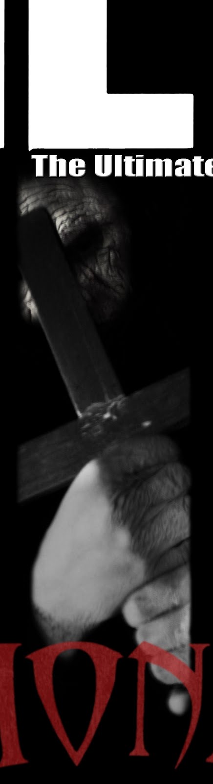
In addition to the presence of the Monk, plot themes are highlighted across both platforms. The paranormal/spirtual/religious theme is presented through the use of iconography in both the trailer and poster. The trailer (shown above left) shows the protagonists

performing a spiritual Ouija board in a dark room candles. The presence of the Ouija board and candles in the dark makes the board itself seem sinister and is also suggestive of ancient religious rituals. The implication made here is that the act of performing a Ouija board is what summons the tortured spirit of the monk. This implication pertaining to the plot is furthered in the movie posters tagline, which reads: "a tortured spirit rests...". The tagline plays on spirtualistic notions related to Ouija boards - some people believe that awakening a tortured spirit via the Ouija board will be followed by paranormal and horrifying events. I feel this is a particularly powerful effect as the interaction between trailer and poster is an exaggeration actual existing ideas. In coherence with the horrific conventions use, there is a similiarity between the lighting of the Ouija board and the tagline as both seem to be lit in a way that connotes creepy and sinister activity. The prevalence of religion is still furthed by additional iconography within the poster (shown top right). The large scale crucifix again relates to the religious connotations of the Ouija board. But it's representation here is the evil side of religion, death and resurrection and the crucifix is placed to conceal the identity and also to appear as a defensive or offensive weapon. These subtle links are useful to perpetuating and exaggering the horror genre and the religious and spiritual thematics that may be seen as overt or subtle depending on the academia of the viewer; nonetheless connotations of evil, horror violence are clearly highlighted throughout in an ambiguous and enticing style. 
Another useful interaction between the two texts was the use of similar font styles. Albeit the fonts are not exactly the same, the connotations certainly are. A portion of the trailer (shown right) is devoted to enveloping the plot and simulates the protagonists reading the mythiological book they find. The computer-generated scene suggests the historical background of the religious/spiritual evil and is superimposed over an image of it's location. A similar style text is used throughout the poster.
(Shown above) The billing block carries a similar ancient and withered feeling to the font used within the trailer. However, there are contextual differences - while the trailer's text relates to the plot and horror conventions, the poster's text is in admiration of trailer conventions; it details various production values of notable producers, editors, actors and so on. But the noteriety of this style is to simulate the effectiveness of interaction. In order to increase the levels of interaction between texts it may have been useful to make both fonts more similar and the notable difference between the two is the use of serif and sans serif. Despite this, I feel the desired effect is still powerful.
Publicity
Publicity is an additional outlet in the chain of the marketing plan. Promotional packages are negotiated and agreed between the distribution company with various forms of independent media outlets including: magazines, television, radio and the internet. The film distributor tries to create a level of synergy with alterior media outlets and in the case of magazines; it is highly useful for the appearance of a film on a magazine cover. Getting a cover picture of the film can be useful, especially in publicly trusted magazines. For instance: those who trust "Empire" will connect the cover picture with the significance of the magazine itself; the basis of loyalty and trust between magazine and consumer ties in with the distributor. In addition, the distributor branches out to other media outlets with press packages which allows certain outlets to interviews with casts and directors, exclusive images, video and articles and other imagery to present in the chosen media outlet. The use of these press packages allows the media outlet to advertise "exclusive" content which makes loyal customers feel priveliged to information known only to that supplier. Doing this is significant and is essential for creating media hype and public word of mouth. The benefit of the this project means that I act as the distributor and the independent media outlet - in this case, a magazine company. Exploiting this and using my magazine cover I presented how I would hope to interact between distribution and media companies in order to create effective publicity and hype.
The use of key magazine conventions was essential to effectively advertise Monk as a reputable horror film. My main idea was to present Monk as a special-edition of already famous and reputable magazine "Total Film". (Shown below).
The use of "Total Film" and it's respective logo is to add a level of security to film fanatics and viewers, there is a level of insurance surrounding the quality and notoriety of it's independent editorial value - those loyal to, or those in knowledge will respect the magazine; if "Total Film" magazine hold an exclusive issue, the film must be of high value.


 s been given a number of exclusive details in their agreed marketing package. The notion of exclusivity is not subtle and a coverline (above) is presented above the masthead. The colouring flow in a pattern of red and white which contrast with the background; the red links to the key conventions of the horror genre and the subtle presence of red in the trailer scenes, poster and main coverline. The levels of similarities are also useful to subtly target the required audience; the abundance of reddish tones in relation to the content target horror film fans. The use of red needs to correlate with the imagery in order to achieve this effect, for instance: the colour red in conjunction with couples kissing would point to romance based genres. The main image is comprised of three columns (shown above left) two of which contain insights to unseen film stills and a third which contains a horrifying picture of the Monk. The outer columns which contain exclusive film stills are to highlight the exclusivity and to create intrigue to the target audience, both to the film and the magazine. A slight green colouration is used to connote the levels of supernaturality within the film. This green is then contrasted by a blood red serif font that creates the main coverline "Monk". The use of green and red adheres to typical magazine conventions and limits the colour scheme to few colours to create a visually harmonious composition. This colour scheme is shared with a font scheme whereby the
  magazine "Monk" font and colourings are used in the coverlines (shown right) to accentuate important points. The blood red font loosely interacts with the "Monk" title shown on the movie poster (shown below). The serif fonts act together to create a
 visual harmony between pieces and both are representative of ancient religious scripture - one of the recurrant themes of the Monk marketing plan.
The notions of exclusivity are again perpetuated within the top coverline shown (above right) saying: "FIRST review of new MONK film and interview with SEAN OFFORD". The notion present here is that in the agreed media package, actors, directors of high notoriety and importance are to be interviewed in additional media sources. This way the magazine cover interacts well with the movie poster; the production values present within the billing block are accented in the coverlines of an exclusive Monk issued "Total Film" magazine. Additionally, the accentuated name "SEAN OFFORD" is meant to be field-specific - a name known within the horror film world. Presenting this name alongside the "Monk" film imagery suggests that the notable directing abilities of Sean Offord are apparent in the film, thereby using the name as a means to attract horror audiences.
Word of Mouth
The need for interaction between advertising texts and publicity texts is essential in creating a basis of strong word-
 of-mouth based advertising. This is when the reception of the film, trailer, poster or magazine coverage creates a lasting impression on the consumer; these positive feelings are then shared amongst peers, friends and colleagues and therefore hype grows quickly. The concordance of good quality advertising and positive word of mouth hype creates a solid basis for targeting the audience. However, this works respectfully with negative feedback; if the film or it's ancillary products are percieved negatively, so will the word-of-mouth hype and therefore the urge to see the film will be significantly less. If the effects of word-of-mouth advertising are successful, then the attributes present with come across to all recipients of hype. This means that friends telling friends about the film will promote the genre and it's features both subtly and overtly. This effective means of hype means that in addition to news of the film spreading quickly, only attributes that attract the recipients of information will desire to watch the film. Making use of trailer, magazine, poster and horror conventions I feel I have created a solid basis of interaction between all three products that will entice the target horror audience in the best way possible, allowing for a generation of positive word-of-mouth hype and most importantly, a great desire to see the film itself.
Another excellent answer but again watch your language. You do not mean "prolific" in your first sentence under the "advertising" heading. You need to explain a little more about how the distributor will try to generate such favourable publicity as getting its film on the front cover of the movie magazine. Consider press packs and what goes into them, press junkets, the organisation of interview rounds for stars directors etc on TV shows and for magazine and newspaper publishers. Then you can situate your magazine cover as an example of this. When analysing the magazine cover you should really think about how it is trying to attract ITS target audience at point of sale rather than how it is trying to promote your film, which is not its purpose.
ReplyDelete