Thursday 7 April 2011

Storyboards and Shot Lists

Storyboards and shot lists were essential in planning the process of shooting the trailer itself. Using the board we could note down images, locations, shot styles, effects and ordering. This helped to map out an effective method for shooting the trailer material. The chronology of shooting was fairly unimportant as gathering footage was based on oppurtunity and setting - the chronology was altered in post-editing. Adhering to the content in the storyboard was not very consistent and often ideas for shots or the narrative itself changed while actually shooting. (Clicking the above images will open an enlarged picture)

Thursday 31 March 2011

Original source photographs for ancillary products

When creating the ancillary tasks it was important to gather a range of primary source images. The images, taken by myself, depict my desired interpretation of the "Monk" marketing campaign and includes relevant iconography. Having acquired some images of graveyards in my A2 Photography, I had a bank of useful images to work with. In addition to these images, several stills from the actual trailer are used.


Drafts of Ancillary Products

The ancillary products are an important part of the marketing plan, but in order to effectively create my designs, I felt it was necessary to do some planning beforehand. Below are photocopies of my simplistic drafts that helped me account for the layout of my final images. Clicking on these images enlarges them within in the browser. Magazine Drafts Poster Drafts

Wednesday 9 March 2011

Final Product: Ancillary Texts


How did you use new Media Technologies in the construction and research, planning and evaluation stages?"

In order to research, plan, construct and evaluate the main and ancillary products it was essential to exploit the benefits of new media technologies. Below are icons and screenshots of the various programs used with an explanation on their prevalence.

Youtube
Youtube, at http://www.youtube.com/, exploits one of the newest growing Web 2.0 phenomenon, allowing easy access to homemade and professional videos and the ability to upload own media. The use of youtube was essential in the planning stages and allowed me to search through an endless supply of horror movie trailer free of charge. This was useful to gather and present ideas; linking blogger and youtube was easy with an embedding code and thereon I could write about and evaluate a video. investigating the horror and trailer conventions that I felt were helpful to me. The easy access of youtube meant that finding research material was easy and relevant - relevant because youtube is about video media and therefore the website is respectful of video quality and copyright infractions. In addition to research, youtube is a useful means of presenting the final trailer. Uploading the final trailer video onto youtube meant that it could be viewed on and shared easily. This meant I could present it effortlessly on my blog and importantly, share the link to the video in order to gain audience feedback and make any necessary amendments.

Survey Monkey
Survery Monkey, at http://www.surveymonkey.com/, is a free-to-use Web 2.0 internet website/program that allows a user to navigate or create surveys and questionnaires. Survey Monkey was an essential step research and planning portion of the coursework and allowed me to tailer-make a questionnaire that asked questions that I needed. The benefit of using this website is that questionnaires are created in an interactive digital format with a direct link/url which meant it could be easily shared with peers. The additional advantage is that the questionnaire was embeddable, leaving me the oppurtunity to embed a working version of the questionnaire onto my blog as both: a working example and the oppurtunity to gain more relevant information.

Microsoft Outlook
Microsoft Outlook is an official email program created by Microsoft and is present in my workplaces and accessable by most computers with internet. I made use of Microsoft Outlook as an extension of the use of Survey Monkey. Using the link/url supplied with the created questionnaire I created an email to peer groups and teachers within college asking them to answer my questionnaire. This was very useful as a means of planning, giving me a direct connection to my peer group, who are the target group for the horror genre, as well as gathering opinions from other age ranges. The direct link meant that the interactive questionnaire could be answered quickly and was hastle free, with little pressure in answering it and lying about answers to questions.

Facebook
Facebook, at http://www.facebook.com/, is the worlds most visited social networking website and allows users to share videos, pictures, web media and exchange comments between peers. Facebook was used in a similar way to Microsoft Outlook; sharing the questionnaire link/url offered Facebook friends the oppurtunity to answer questions in a hastle-free environment. This was essential in the planning stage as we could acquire a high range of response material from our targeted audience.

Microsoft Excel
Microsoft Excel is a program created by Microsoft typically for business purposes and allows the user to configure and present data in a number of ways. Using excel was fundamental in the planning stage and allowed me to configure, present and evaluate the questionnaire responses. Tallying the responses from Survey Monkey meant I could generate graphs to present the data; the visual representation of findings was an essential way to present target audience trends and helped mould the plot and production of the final product. Saving the Excel graphs as jpeg images meant they could be easily uploaded and evaluated within my blog.


Final Cut Pro
Final Cut Pro is non-linear industry quality video editing program designed specifically for use on Apple Macs. There are several benefits in using Final Cut Pro on a Mac; the speed and power of the Mac and the program meant that video editing and reviewing was smooth and effortless while the program itself was professional and easy to use. Final Cut Pro is the main program used in the creation of the final film trailer. Learning to use the software was fairly easy as I have had some experience in the use of Adobe Premiere Pro and so I had to adjust to the interface of the program. Through extensive use of this program I learned the benefit of colour-corrections and the effectiveness of transitions - for instance where and when to use cuts or dissolves. I found the system for creating titles were far more diverse and the overall interface was less confusing and more managable than anything I have worked with before. It quickly became apparent that from the multitude of various editing options which ones were suited to both the context of our trailer and to the horror genre as a whole. In fact; the production of the video was limited mainly to altering the length, brightness, contrast and colouration of the scene. The use of keyframes was a learned experience for me and helped me to understand the ways in which effects and transitions can be applied to complement the edit. Using this program meant that the imported video maintained a high level of quality throughout editing and with export; the export file is a widely recognised file which meant it could be easily uploaded onto youtube for sharing, reviewing, presenting and evaluating.


Garageband
Garageband is an exclusive Apple Mac product that allows a user to simulate, record, order and create their own music. For this reason, Garageband was essential in the construction process to tailor-make a soundtrack for the "Monk" movie trailer. Where Final Cut Pro specialises in moving imagery, Garageband specialises in the manipulation and creation of audio. I found this program very useful in creating and layering various pieces of music to form my own audio piece; the program was fairly to simple to use and meant that I could create my own sounds and merge them with pre-existing music (more below) to make music that fit well with the trailer. The benefit of Garageband is it's convergence with Final Cut Pro, whereby the visual elements of the trailer could be imported and therefore allowed for the soundtrack to be edited in perfect timing with the visuals. This convergence also allowed for easy transference/exportation of the audio back into the Final Cut Pro project to finalise the entirety of the trailer.


Incompetec


Incompetech, at http://www.incompetech.com/, is royalty-free music website which allowed me to browse through a variety of free-to-download music tracks. Finding the right tracks was time consuming but necessary to find sounds that I could otherwise not make myself. Downloading the song itself was easy and saved as an .mp3 file, meaning it could be easily imported into both Final Cut Pro and Garageband.


Adobe Photoshop CS5


Adobe Photoshop CS5 is the latest digital photo manipulation/processing program available from Adobe - Photoshop has prevalence throughout the world and is the absolute best in it's field of digital manipulation. Photoshop was essential in the construction stages of the ancillary products - the movie poster and magazine cover. Photoshop allowed me to manipulate primary source images in a number of ways that helped to create a recurrant theme presented in the final film trailer. Previous experience in Photoshop meant that I found the construction of these pieces easy and enjoyable and I feel I have created a product I am happy with. The benefit of Photoshop meant I could use many layers of effects and imagery, in some cases hundreds, to achieve my final piece; this is supported by the use of .psd files (Photoshop Document Files) whereby I saved the project as .psd and allowed me to manipulate the various layers each time I opened it. Upon finishing I saved the images as a well recognised and accepted .jpeg file, this allowed for easy uploading onto flickr and my blog for further presentation and evaluation.

Blogger
Blogger, at http://www.blogger.com/, is used in order to exploit technological advances and Web 2.0 technology. The entirety of the A2 Media coursework makes use of this modern day technology as a way of grouping together the planning, constructing, researching and evaluating stages of the coursework brief. Using a blog service is a brilliant way to construct a portfolio of coursework in a realistic manner; blogs are the online version of diaries and so using a blog is a new and visually appealing way of presenting work. Updating the work online means that the coursework can be accessed anywhere and more importantly can be assessed by a teacher anywhere at anytime. Recieving comments from the teacher on my blog has been useful in altering my material to ensure I attain my best possible grade. The main benefit however, is it's versatility in presentation - the proliferation of the website "Blogger" has meant that I can directly link between other media websites such as Flickr and Youtube to present research, planning and the final products.

Flickr
Flickr, at http://www.flickr.com/, is, like youtube, another Web 2.o based website that allows for the easy navigation of amateur and professional photography, with the ability to upload own content. Flickr was an excellent help in planning and researching for the final and ancillary products. Using Flickr I uploaded screen shots, movie posters and magazine covers of sample work and my own ancillary tasks; using Flickr's annotation tool I applied annotation directly onto the image and then subsequently linked the image onto my A2 media blog. This was a new and exciting way of performing a textual analysis of media products and exploits new digital media. Using the direct annotation tool made it easier to highlight portions of images and made the analysis clearer and more visually appealing.

In terms of evalution; I found the use of a blogging program refreshing and creative as opposed to a traditional paper-based or essay-based format. My experience in other A2 subjects: Photography and Communication and Culture helped me to shape the way my blog could be viewed and alternatively widened my range of presentation devices in these other subjects. I felt it was useful to incorporate the technological zeitgeist and combine work from various internet-based sources such as: flickr, youtube and blogger. To me, it meant that various type of medium: text, still images and audio-visual content could be presented and evaluated visually; it allows the viewer to remain engaged and interested due to a wider range of stimulus. While some people prefer to remain conservative and traditional by writing an abundance of essays; I enjoyed presenting work in an organised and visually enticing way that was intune with modern technology.

What have you learnt from your audience feedback?

Post-screening feedback:
Having used the previously shown audience feedback to shape and ultimately configure the film trailer, it was important to do a screening of the final product to gain reception of my peers/target audience. This was performed in class in a turn-taking ritual whereby the trailers of others and myself were shown. From this comments were made from each member of the class about positives and negatives of horror and trailer conventions.

The scan above shows the detailed notes taken within a period of class film screenings. In turn the entire class presented their individual film trailer and notes were made on it's positive and negative aspects as both a trailer and a horror film. This was a useful technique to see how my peers and my target audience created their own film trailers - it allowed me to see the varied use of horror and trailer conventions and the way sin which I could possibly incorporate them into my own piece.

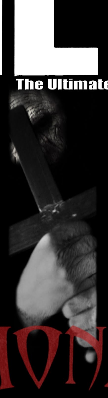
The actual feedback generated was both generous and enciteful; the direct feedback from both my peers and the target audience of the horror genre meant that I could alter the trailer to most effectively attract the target audience. The majority of positive feedback lent itself to horror conventions. The iconography used; such as the Monk's outfit, lanterns, candles, ouija board and settings, were found to be particularly useful in setting the horror scene; the use of darkness was especially favoured for creating a dark and sinister feel. Additionally positive comments were made about the effectiveness of the music and camerawork and how it related to the theme - the sounds of Monk chanting and heavy drums, as well as the use of the hand held camera and close up shots to adhere to typical horror genre techniques. The majority of negative feedback was centred around trailer conventions and peers commented that the edit was too long and slow paced. In terms of the audio-visual content, it was suggested that the chronology was too confusing and that, although the music was fitting, it still needed some altering.

In order to enhance the quality of the horror trailer, it was imperitive to make corrections based on the constructive criticism of my peers and target audience. It was important to maintain the appearance of horror conventions and the praised iconography and darkness. From thereon most clips were shortened or quickened, with some irrelevant shots being removed in order to quicken the pace and shorten the sequence. The length of trailer changed significantly and the pace was much more impactful and exciting. Adhering to the feeback given, some scenes were rearranged so that the chronology of the sequence was more fitting. For instance; the original cut showed the car arriving at the scene at the end of the trailer, while this made sense to my group and I, others found it confusing and therefore it was moved to a much earlier point. Due to significant changes in the trailers speed and the speed of clips within the sequence, there was a considerable re-working of the trailer's audio. The soundtrack was altered so that the haunting piano played exactly at the right intertitles and the heavy pounding drums built up in direct relation to the visual side. The drum beats mimicked the pace of the visual portions while a more significant backing track was added which empowered the overall speed and suspense. The soundtrack was made to end fairly abruptly on a suspending image of a close up silhouetted view of the monk - a shot favoured in our feedback. The shot was lengthened as a way of increasing audience engagement, while it subtly faded to black and ended the advert. Rather critically was the removal of one scene dubbed "The Boy Band Scene" in the audience feedback; due to it's response, it was necessary for it's removal to avoid any humorous flair.

While audience feedback was incredibly important in shaping an already-existing final product, it was essential that a high level of audience research prior to filming was necessary as a way to mould the plot and storyline, as well as the way in which the trailer itself was constructed and conveyed.


Firstly, I created a questionnaire on the website http://www.surveymonkey.com/ which enabled me to configure a custom-made questionnaire that could be distributed digitally and interactively. Using the provided link/url requests were sent via Facebook and Microsoft Outlook in order to gather information from the main target audience; teenagers. I ensured the questionnaire covered questions that could gather a range of quantitative and qualitative data; this is so that I could ascertain definitive categories and facts, while at the same time, gathering personal trends within horror films.

The questions used are as follows:
1) Are you male or female? [c]
2) How old are you? [c]
3) Do you like horror movies? [c]
4) What type of horror movies do you like? [c]
5) What are your favourite horror movies? [p]
6) What aspects do you like within a horror movie? [p]
7) What horror settings do you prefer? [c]
8) How often do you watch horror movies? [c]
9) Who are your favourite horror directors? [p]
10) Why do you watch horror movies? [p]

The questions are divided into two categories for specific reasons:

[c]: Refers to answers that can be [c]atgorised or quantative data. These questions aimed to obtain general statistics about the sample group and to also evaluate whom the exact target audience is in correlation to demands made.

[p]: Refers to answers that are [p]ersonal or qualitative data. These questions aimed to give the answerer the oppurtunity to offer answers that could not otherwise be covered in set categories. For instance, the range of personal reasons for favouring; settings, directors, aspects and themes are tangible. However, using qualitative allowed me to analyse certain recurring styles, themes and ideas that I could use as a basis for emulating.

It would be stupidity to gather such research and then disregard the responses; for this reason, the trailer is directed to the views of those shown within the questionnaires. The usefulness of such research was imperative and ultimately helped shape the style of the trailer and created bank of ideas for which I could work from.

Having gathered the data, presentation of analysis was necessary to understand the trends within. From here on, I divided male and female responses to [c] questions in order to understand the gender patterns relating to horror; this also accounted for outliers and enabled me to understand what females or males particularly liked or disliked or what was considered unnecessary or average. This procedure was vital to me in understanding the target audience and I felt understanding the preferences of each gender would help to create a product that would appeal to both. As is obvious in the graph there is an order of trends, where the most favoured category is the highest bar - using this representation it was easy to ascertain which areas and which attributes to focus on to appease and entice the target audience. In terms of the [P] responses I looked for common trends within response to the question and from thereon formed a style basis. Gathering a range of answers was a useful way to collect an idea of attributes such as; the need for gore, suspense or whether the prevalence of religion or paranormal activity was necessary but, it also accounted for the personal flair of certain directors which helped to identify shot types and cameras to use.

The following show summary of the responses collected from questions and the ways in which it shaped the construction of the final movie trailer:


Gender and Age:
This was important to identify that the majority of responses were derived of a typical horror genre audience. As was shown by the questionnaire the majority of those who took the questionnaire were aged between 15 and 20. Interestingly, there were a higher number of female participants and so analysis had to account for this.

Gender and Liking or Disliking of Horror:
In order to further assess the need for accounting for the weighted sample of genders, this set of data was useful to ascertain the balance. An even number of males and females like the horror, while the remainder, obviously, dislike the genre. This meant that all subsequent answers could be taken into account without worry for bias.

Gender and Frequency of Viewing:
It was clear from the data that males watch horror films more frequently than females which suggested to me that more consideration must be taken in order to attract the female viewer while maintaing the attention of the male viewer.

Gender and Preferred Horror Style:
The top findings showed that the favourite horror styles were psychological and thriller based. The ratio to male and female was, again, even and lead me to deeply consider psychological and thriller based plots. Additionally, a high number of females purported to enjoy supernatural horrors and considering the female frequency of viewing, I felt it was important to address this. It is clear that "Monk" covers aspects of thriller and the supernatural; while the psychological side may be somewhat less obvious, but it is something definitely incorporated in aspects of the exploitation of teenagers, their curiosity and whether the "Monk" is physical or psychological.

Preferred Setting
For this, I felt it was less dependent on gender as to the favoured setting. But from the results it was unanimous that the most favoured horror settings were "Unknown places". This was exploited fully within the monk and as shown in the trailer, the exact location of the church/graveyard remains ambiguous with strong feelings of isolation and entrapment - all key conventions of the horror genre.

Favourite Horror Films:
The main trend of favourites here considerably juxtaposed trends noted previously and films such as "Saw", "The Texas Chainsaw Massacre", "Dawn of the Dead" and "American Psycho" which is highly suggestive of violence, gore and death. Death is something vastly exploited in month with the idea of the resurrection of the tortured spirit of the monk. However, I tried to coordinate the trailer in a way that is suggestive of gore and violence in order to entertain the wide range of audence expectations.

Favourite Horror Film Styles:
The recurrent demand of participants was the need to "feel scared" and while this seems like a simplistic idea; it was important to me to create a trailer with a scary and horrific feel without accidentally inducing a level of boredom or comedy that is common in a lot of horrors.

Reasons For Watching:
Here the majority of answers regarded the notion of thrill seeking and perpetuates the aforementioned idea of a thriller-style horror. This solidified the idea of creating a fast paced, thrilling horror trailer.

How effective is the combination of your main product and ancillary texts?

Upon the release of a film, distributors ascertain the marketability of the film by in-depth target audience research. Using the trends of past films and national statistics, distributors pinpoint their exact target audience. From here a marketing plan is built around an economic framework; this determines the expenditure on various media platforms. Distributors spend over £170 million a year on media advertising with over 70% based on television and outdoor advertising. This means that the marketing plan has to be cost-effective and well planned in order to generate enough hype for the film as to create profit.

In accordance to the techniques of professional distributors I had to create my own marketing plan which consisted of three main products: The Official Monk Trailer and Monk movie poster which are regarded as advertising and a magazine cover which is regarded as publicity. The use of these three media components are responsible for generating hype and enticing the target audience specifically to want to see the Monk film.

Advertising
The importance of a trailer within the marketing plan; the audiovisual content is useful for displaying the most the most important portions of content as a way of enticing the target audience. However, there must be careful balance as not to spoil the entirety of the production. In professional terms, the trailer is the most cost-effective means of advertising and is derived from the pre-existing film footage. The prevalence of film trailers is massive in terms of digital medic convergence and can be accessed via: television, cinema screenings, the internet and even mobile phones. The benefits of a trailer is it's versatility and strength as a diverse media product - allowing its consumption anywhere in the world. In addition to the trailer is the partnering media product; the movie poster. A poster is the main image that is meant to capture the ethos of the film as well as detailing production values. The poster is made in harmony with the trailer in order to whet the appetite of the audience and again, the versatility of the poster is something that allows for a wide level exposure - there are over 250,000 sites for posters along the roadside and highways, with many more being shown in buildings, events, cinemas and other public facilities. For these reasons the convergence and interactability of the two products is imperative for success in the marketing campaign.

As the title of the movie suggests; the plot of the film is based around the character/antagonist: the monk. In order to give insight to the film plot I felt it was essential to create a prevalence of the actual Monk's presence within the advertising campaign. While adhering to typical horror conventions in order to effectively entice the target audience I felt it was necessary to present the image of horror and sinister happenings. Preserving the entire identity of the Monk himself was something crucial to me as I felt preserving details of his appearance leads to further ambiguity and intrigue. A recurring theme or technique to accomplish this was the use of darkness; the high levels of night time lighting and blacks meant that even when the Monk was in shot he appeared sillhouetted, creepy and sinister. The still from the movie (shown top left) mirrors the technique used in a portion of the movie poster (shown top right). In the trailer the Monk appears as a silhouette, horrifying and unidentifiable, this was then carried into the construction of the poster whereby the Monk appears to emerging from darkness. The little of the Monk that can be seen shows a decrepid and sinister old man with slight nuances of the paranormal - he appears almost spirit-like in his movements. Another remarkable resemblence is the subtle use of red colouration in the faces of both stills; the flare of lighting in the trailer still matches the slight red filter used in the poster - the typical horror-related colouration used here accentuates the evil notions of the Monk.

In addition to the presence of the Monk, plot themes are highlighted across both platforms. The paranormal/spirtual/religious theme is presented through the use of iconography in both the trailer and poster. The trailer (shown above left) shows the protagonists


performing a spiritual Ouija board in a dark room candles. The presence of the Ouija board and candles in the dark makes the board itself seem sinister and is also suggestive of ancient religious rituals. The implication made here is that the act of performing a Ouija board is what summons the tortured spirit of the monk. This implication pertaining to the plot is furthered in the movie posters tagline, which reads: "a tortured spirit rests...". The tagline plays on spirtualistic notions related to Ouija boards - some people believe that awakening a tortured spirit via the Ouija board will be followed by paranormal and horrifying events. I feel this is a particularly powerful effect as the interaction between trailer and poster is an exaggeration actual existing ideas. In coherence with the horrific conventions use, there is a similiarity between the lighting of the Ouija board and the tagline as both seem to be lit in a way that connotes creepy and sinister activity. The prevalence of religion is still furthed by additional iconography within the poster (shown top right). The large scale crucifix again relates to the religious connotations of the Ouija board. But it's representation here is the evil side of religion, death and resurrection and the crucifix is placed to conceal the identity and also to appear as a defensive or offensive weapon. These subtle links are useful to perpetuating and exaggering the horror genre and the religious and spiritual thematics that may be seen as overt or subtle depending on the academia of the viewer; nonetheless connotations of evil, horror violence are clearly highlighted throughout in an ambiguous and enticing style.

Another useful interaction between the two texts was the use of similar font styles. Albeit the fonts are not exactly the same, the connotations certainly are. A portion of the trailer (shown right) is devoted to enveloping the plot and simulates the protagonists reading the mythiological book they find. The computer-generated scene suggests the historical background of the religious/spiritual evil and is superimposed over an image of it's location. A similar style text is used throughout the poster.
(Shown above) The billing block carries a similar ancient and withered feeling to the font used within the trailer. However, there are contextual differences - while the trailer's text relates to the plot and horror conventions, the poster's text is in admiration of trailer conventions; it details various production values of notable producers, editors, actors and so on. But the noteriety of this style is to simulate the effectiveness of interaction. In order to increase the levels of interaction between texts it may have been useful to make both fonts more similar and the notable difference between the two is the use of serif and sans serif. Despite this, I feel the desired effect is still powerful.

Publicity
Publicity is an additional outlet in the chain of the marketing plan. Promotional packages are negotiated and agreed between the distribution company with various forms of independent media outlets including: magazines, television, radio and the internet. The film distributor tries to create a level of synergy with alterior media outlets and in the case of magazines; it is highly useful for the appearance of a film on a magazine cover. Getting a cover picture of the film can be useful, especially in publicly trusted magazines. For instance: those who trust "Empire" will connect the cover picture with the significance of the magazine itself; the basis of loyalty and trust between magazine and consumer ties in with the distributor. In addition, the distributor branches out to other media outlets with press packages which allows certain outlets to interviews with casts and directors, exclusive images, video and articles and other imagery to present in the chosen media outlet. The use of these press packages allows the media outlet to advertise "exclusive" content which makes loyal customers feel priveliged to information known only to that supplier. Doing this is significant and is essential for creating media hype and public word of mouth. The benefit of the this project means that I act as the distributor and the independent media outlet - in this case, a magazine company. Exploiting this and using my magazine cover I presented how I would hope to interact between distribution and media companies in order to create effective publicity and hype.

The use of key magazine conventions was essential to effectively advertise Monk as a reputable horror film. My main idea was to present Monk as a special-edition of already famous and reputable magazine "Total Film". (Shown below).

The use of "Total Film" and it's respective logo is to add a level of security to film fanatics and viewers, there is a level of insurance surrounding the quality and notoriety of it's independent editorial value - those loyal to, or those in knowledge will respect the magazine; if "Total Film" magazine hold an exclusive issue, the film must be of high value.

To perpetuate the idea of issue exclusivity, the main image was deliberately enlarged in a way that dominates the page. The imagery involved is reminiscent of the iconography and in some cases, scenes shown in the trailer and poster. This is where a high level of exclusivity is promoted and it is suggesed through this clear interaction, that "Total Film" has been given a number of exclusive details in their agreed marketing package. The notion of exclusivity is not subtle and a coverline (above) is presented above the masthead. The colouring flow in a pattern of red and white which contrast with the background; the red links to the key conventions of the horror genre and the subtle presence of red in the trailer scenes, poster and main coverline. The levels of similarities are also useful to subtly target the required audience; the abundance of reddish tones in relation to the content target horror film fans. The use of red needs to correlate with the imagery in order to achieve this effect, for instance: the colour red in conjunction with couples kissing would point to romance based genres. The main image is comprised of three columns (shown above left) two of which contain insights to unseen film stills and a third which contains a horrifying picture of the Monk. The outer columns which contain exclusive film stills are to highlight the exclusivity and to create intrigue to the target audience, both to the film and the magazine. A slight green colouration is used to connote the levels of supernaturality within the film. This green is then contrasted by a blood red serif font that creates the main coverline "Monk". The use of green and red adheres to typical magazine conventions and limits the colour scheme to few colours to create a visually harmonious composition. This colour scheme is shared with a font scheme whereby the magazine "Monk" font and colourings are used in the coverlines (shown right) to accentuate important points. The blood red font loosely interacts with the "Monk" title shown on the movie poster (shown below). The serif fonts act together to create a visual harmony between pieces and both are representative of ancient religious scripture - one of the recurrant themes of the Monk marketing plan.


The notions of exclusivity are again perpetuated within the top coverline shown (above right) saying: "FIRST review of new MONK film and interview with SEAN OFFORD". The notion present here is that in the agreed media package, actors, directors of high notoriety and importance are to be interviewed in additional media sources. This way the magazine cover interacts well with the movie poster; the production values present within the billing block are accented in the coverlines of an exclusive Monk issued "Total Film" magazine. Additionally, the accentuated name "SEAN OFFORD" is meant to be field-specific - a name known within the horror film world. Presenting this name alongside the "Monk" film imagery suggests that the notable directing abilities of Sean Offord are apparent in the film, thereby using the name as a means to attract horror audiences.

Word of Mouth

The need for interaction between advertising texts and publicity texts is essential in creating a basis of strong word-of-mouth based advertising. This is when the reception of the film, trailer, poster or magazine coverage creates a lasting impression on the consumer; these positive feelings are then shared amongst peers, friends and colleagues and therefore hype grows quickly. The concordance of good quality advertising and positive word of mouth hype creates a solid basis for targeting the audience. However, this works respectfully with negative feedback; if the film or it's ancillary products are percieved negatively, so will the word-of-mouth hype and therefore the urge to see the film will be significantly less. If the effects of word-of-mouth advertising are successful, then the attributes present with come across to all recipients of hype. This means that friends telling friends about the film will promote the genre and it's features both subtly and overtly. This effective means of hype means that in addition to news of the film spreading quickly, only attributes that attract the recipients of information will desire to watch the film. Making use of trailer, magazine, poster and horror conventions I feel I have created a solid basis of interaction between all three products that will entice the target horror audience in the best way possible, allowing for a generation of positive word-of-mouth hype and most importantly, a great desire to see the film itself.